Wedding Colour Palettes for 2027: Six Palettes and How to Use Them
Choosing a colour palette is one of the first styling decisions a couple makes, and one of the hardest to undo once the linen, flowers and stationery are ordered. This guide looks at six palettes that are being widely talked about for 2027 weddings and, more usefully, shows how each one translates into real orders: tablecloths and napkins, flowers, candles and lighting, and what to tell your suppliers.
Watch more on TikTok and Instagram.
Before you pick: three rules that make any palette work
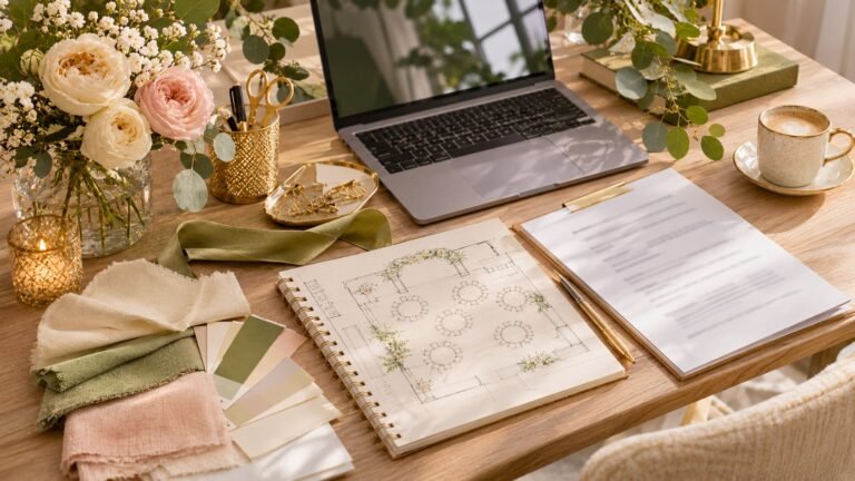
Choose one lead colour, one support colour and one neutral. Most palettes that look muddy in photos have four or five colours of equal weight. A simple ratio works well: roughly 60% neutral (linen, walls, chair covers), 30% support colour (napkins, runners, greenery) and 10% lead colour (flowers, candles, stationery accents).
Test colours in the venue’s light. A dusty blue that looks soft in daylight can turn grey under warm tungsten bulbs, and ivory can look yellow next to bright white tableware. Take fabric swatches and a flower photo to your site visit and look at them at the time of day your reception starts. Our venue site visit checklist includes what to photograph.
Write colours down as references, not adjectives. “Sage” means something different to every florist. Give suppliers a paint chip, a Pantone-style reference or a photo, and say which items must match exactly and which can be “in the family”.
1. Butter yellow, ivory and soft green
Pale, creamy yellow has moved from spring bridal showers into full wedding schemes. It is warm without being loud and flatters most skin tones in photos.
- Linen: ivory tablecloths with butter-yellow napkins, or the reverse for a bolder table. Avoid bright white cloths, which make pale yellow look dirty.
- Flowers: yellow ranunculus, garden roses, tulips and mimosa (in season late winter), with plenty of soft green foliage.
- Lighting: warm white candles and festoon bulbs; this palette loves candlelight.
- Watch out for: yellow can wash out in harsh midday sun, so for outdoor ceremonies add a slightly deeper tone such as ochre in the bouquets.
We cover this palette in depth in butter yellow event styling.
2. Mocha, chocolate and blush
Brown is a surprising wedding colour until you see it done well: think coffee-toned velvet, caramel candles and pale pink flowers. It suits autumn and winter weddings and venues with wood, brick or leather.
- Linen: oatmeal or natural linen cloths with mocha napkins; a chocolate velvet runner on long tables.
- Flowers: blush and café-au-lait roses, toffee-coloured carnations, dried grasses and bronze foliage.
- Lighting: amber glass votives and plenty of low candlelight; avoid cool LED uplighting, which makes brown look grey.
- Watch out for: too much brown in a dark room. Keep the neutral (oatmeal, cream) dominant.
3. Dusty blue, silver-grey and white
A calm, classic palette that works in summer and winter alike. It suits coastal venues, marquees and modern halls.
- Linen: white or pale grey cloths, dusty-blue napkins or chiffon runners.
- Flowers: white roses, hydrangea, delphinium, thistle and silver-dollar eucalyptus.
- Lighting: neutral-to-warm white. Very warm bulbs push blue towards green-grey, so test before you commit.
- Watch out for: blue flowers are limited and some are dyed; ask your florist which stems are natural and in season. If you want a deeper blue, see our notes on getting cobalt blue decor true to colour.
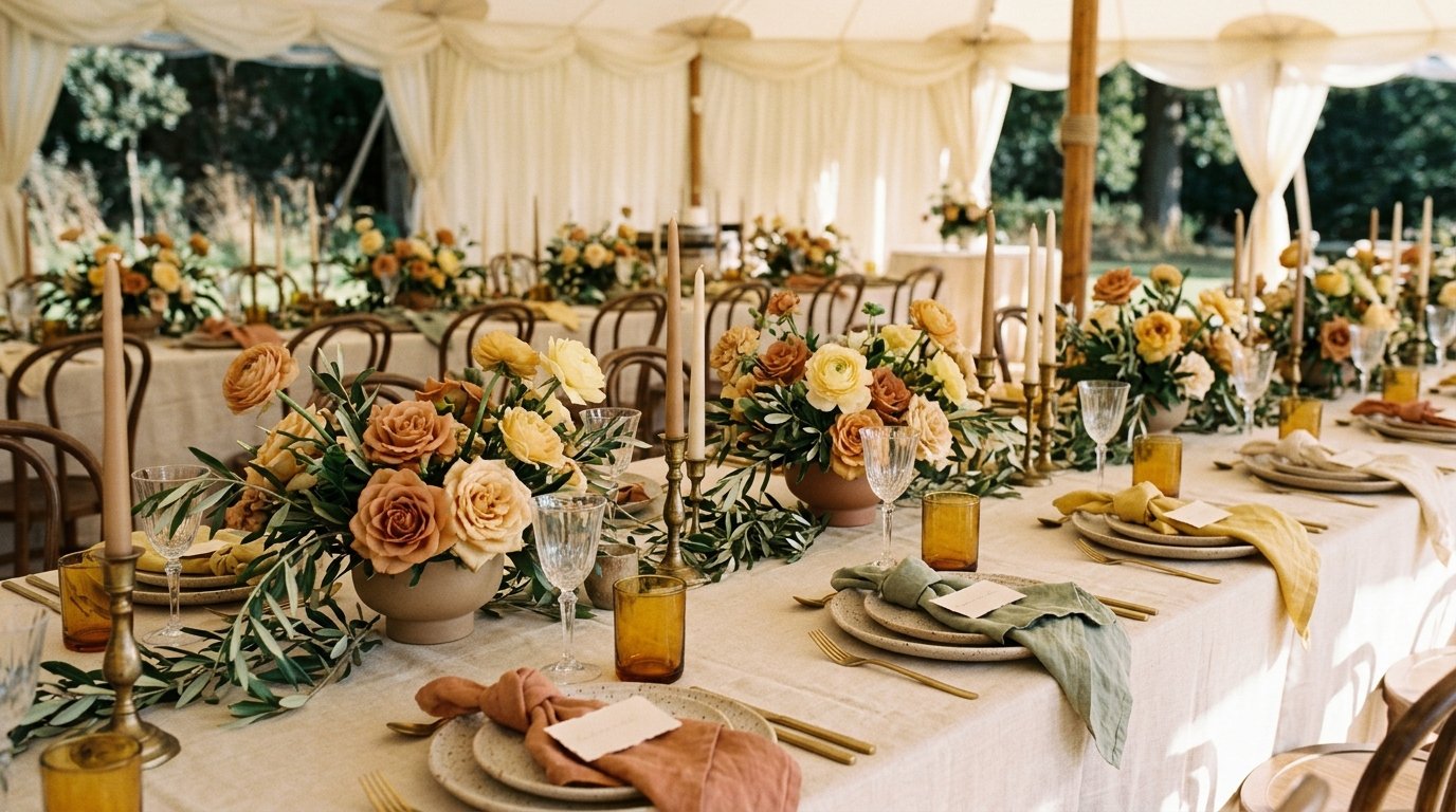
4. Terracotta, sage and sand
Earthy and relaxed, this palette suits outdoor, rustic and destination weddings and works well with natural materials such as rattan, clay and raw wood.
- Linen: sand or natural linen cloths, terracotta napkins, sage runners.
- Flowers: burnt-orange roses, dahlias, ranunculus, pampas and olive branches.
- Lighting: lanterns and warm festoon lighting; terracotta pots can double as candle holders.
- Watch out for: terracotta and orange are easy to confuse. Show suppliers a photo of the exact clay tone you mean.
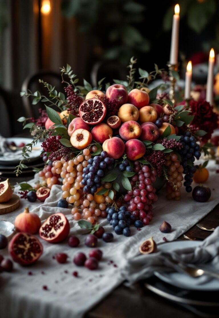
5. Burgundy, cherry red and gold
Rich reds are back for evening and winter weddings, often paired with brass or gold. The look is dramatic but can be done on a modest budget, because a few strong flowers go a long way.
- Linen: ivory or champagne cloths with burgundy napkins; save full red cloths for a small top table.
- Flowers: deep red roses, dahlias, ranunculus, anemones and dark foliage.
- Lighting: gold chargers and brass candlesticks reflect candlelight; keep it warm and low.
- Watch out for: deep reds can look almost black in photos with little light. Ask your photographer how they handle dim receptions.
6. Olive, cream and natural wood
Olive green has become a shorthand for understated luxury: quieter than emerald, warmer than sage. It is ideal if you want greenery to be the main colour rather than flowers.
- Linen: cream cloths, olive napkins or velvet runners.
- Flowers: mostly foliage (olive branches, ruscus, eucalyptus) with white or cream blooms.
- Lighting: warm candlelight and wooden or brass holders.
- Watch out for: olive fabrics vary from khaki to almost brown. Order napkin samples before you order 150 of them.
How to apply your palette, item by item
Once you have chosen, decide where the colour actually goes. A simple order of priority keeps costs down:
- Flowers and candles carry most of the colour and are easy to adjust late in planning.
- Napkins and runners add colour cheaply; tablecloths in a neutral can then be reused for other events or hired as standard stock.
- Stationery and signage repeat the lead colour; one accent is enough.
- Attire for the wedding party can pick up the support colour, but it does not need to match the tables exactly.
- Lighting ties everything together. Agree a colour temperature (warm white is safest) with the venue or lighting supplier.
If you are dressing round tables, our table centrepiece ideas show how to bring a palette to the centre of the table without blocking conversation.
Briefing suppliers on colour
Put your palette on a single page and send the same page to the florist, linen hire company, cake maker and stationer. Include:
- three to five colour swatches or photos, labelled lead, support and neutral;
- which items must match exactly (for example napkins and bridesmaid dresses) and which can vary;
- the venue’s lighting and wall colours;
- any colours to avoid (a clashing carpet, a family member who hates orange).
Our guide to writing an event supplier brief has a worked example you can adapt. If you are still unsure which overall look you want, try the free style finder before choosing colours, and keep the decision in one place with the Wedding Planning Binder.
Budget notes
Neutral linen is usually standard hire stock, while coloured or velvet linen often costs more per piece and may need to be ordered in. Out-of-season flowers in a specific shade (blue in winter, mimosa in summer) can be expensive or unavailable, so ask your florist which palettes are realistic for your month. Candles are one of the cheapest ways to add colour, but check your venue’s rules on open flames.
More colour ideas on TikTok and Instagram (@eventory.agency).
Frequently asked questions
How many colours should a wedding palette have?
Three is the easiest to manage: a neutral, a support colour and a lead accent. You can add a metallic (gold, silver, brass) as a fourth without making it busy.
Should the palette match the season?
It does not have to, but seasonal flowers are cheaper and fresher. Pale palettes are easier in spring and summer, deep palettes in autumn and winter.
Do bridesmaid dresses have to match the tables?
No. Many couples choose dresses in the support colour and keep the lead colour for flowers. Mixed shades of one colour also photograph well.
When should we fix our palette?
Before you book the florist and order stationery, usually six to nine months out. Our event planning timeline shows where it fits.