Olive Green Event Styling: Palettes, Flowers, Lighting and How to Brief Suppliers
Olive green has moved from the edges of event styling to the centre of it. A short video on our store channel called it “the new luxury”, and the reason is easy to see: olive is calm, it flatters skin tones in photographs, it sits naturally next to greenery and it makes cream, gold and terracotta look richer than they do on their own. This guide explains how to build an olive green event palette that looks deliberate rather than drab, which flowers, linens and tableware work with it, how to light it, and how to brief suppliers so that everyone delivers the same green.
Watch more on TikTok and Instagram (@eventory.store).
Why olive green event styling works
Olive is a yellow-leaning, slightly greyed green: the colour of olive leaves and cured olives rather than fresh grass. In colour terms it is a dark yellow with low saturation, which is why it reads as warm and earthy instead of bright (the reference description of olive puts it between yellow and green, darkened). That low saturation is its strength at events. It does not compete with faces in photographs, it hides the small marks that appear on linen over a long evening, and it looks good in daylight, candlelight and the warm white of most venue lighting.
It is also forgiving with mixed suppliers. A florist’s foliage, a hire company’s sage napkins and a stationer’s moss-green ink will rarely match exactly, but every one of them sits comfortably inside an olive scheme. With a saturated colour such as emerald or red, those small differences jump out.
Where olive goes wrong is when it is used alone or in large flat areas. A room of olive tablecloths, olive chair sashes and olive backdrop fabric looks heavy and military. The trick is to treat olive as the anchor of a palette and let lighter and warmer colours do the lifting.
Five olive green palettes that photograph well
Each palette below lists the anchor, the supporting colours and a sensible split for a room. Use roughly 60% neutral, 30% olive and 10% accent; it keeps the green rich without letting it take over.
1. Olive, ivory and brushed gold
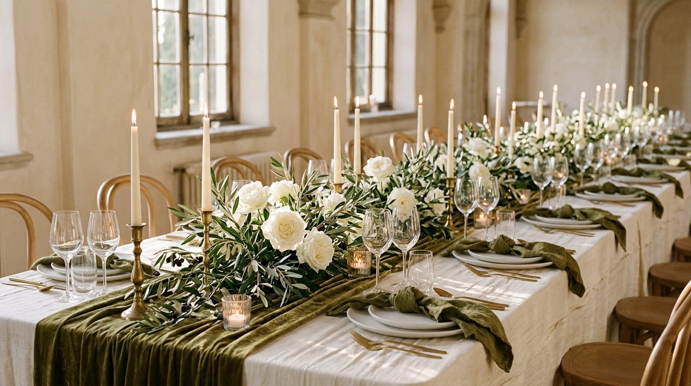
The classic version for weddings and formal dinners. Ivory or warm white linen, olive napkins or runners, brushed gold cutlery and candle holders. Flowers in white and cream with plenty of olive branches. It suits ballrooms, hotels and any venue with gold or brass fittings already in place.
2. Olive, terracotta and sand
Warm and relaxed, ideal for outdoor and late-summer events. Sand or oatmeal linen, olive runners, terracotta napkins or votives, and dried grasses with orange and rust flowers. It pairs well with the earthy approach in our terracotta decor guide.
3. Olive, blush and cream
A softer scheme for engagement parties, bridal showers and spring weddings. Cream linen, blush napkins, olive foliage and pale pink garden roses. Keep the olive in the greenery rather than the textiles so the room stays light.
4. Olive, black and natural wood
A modern, slightly architectural look for corporate dinners, product launches and industrial venues. Bare wood or black tables, olive linen napkins, black cutlery and white candles. Use sculptural branches instead of dense floral arrangements.
5. Olive, butter yellow and white
Fresh and cheerful for daytime parties, christenings and brunches. White linen, olive greenery, butter yellow napkins or ranunculus. If you like this direction, our butter yellow styling guide covers the yellow side in more detail.
Flowers and greenery for an olive scheme
Real olive branches are the obvious choice and they last well out of water compared with many foliages, which helps for garlands and table runners that are installed hours before guests arrive. Ask your florist about availability and price early, because good branches with silvery leaves are not always in stock and imported stems vary in quality. Useful companions include:
- Foliage: eucalyptus (silver dollar or parvifolia), ruscus, pittosporum, rosemary and bay. They share olive’s grey-green tone.
- White and cream flowers: garden roses, lisianthus, spray roses, stock and sweet peas in season.
- Warm accents: rust chrysanthemums, orange ranunculus or dried bunny tails and pampas for the terracotta palette.
- Texture: small bunches of real olives on the vine, lemons or figs on platters for food stations.
Budget tip: greenery-heavy designs usually cost less per metre than flower-heavy ones, so an olive scheme is a good way to fill long tables. Our event flowers planning guide explains how to estimate quantities and what drives the florist’s price.
Linens, tableware and stationery
Olive is easier to source in napkins and runners than in full tablecloths, and that is also where it looks best. A practical shopping list:
- Tablecloths: ivory, white, sand or natural linen. Avoid full olive cloths on round tables unless the room is very bright.
- Napkins and runners: olive, sage or moss in a matte cotton or linen. Velvet runners add depth for winter events.
- Plates: white or cream chargers; a stoneware or reactive-glaze plate in green works for rustic tables.
- Glassware: clear is safest; smoked or amber glass suits the black and terracotta versions.
- Cutlery: brushed gold for formal, matte black for modern, plain silver works with everything.
- Stationery: olive ink or olive card with white or gold lettering; keep the same green on menus, place cards and the seating chart.
Hire companies name colours differently, so “sage” from one supplier can be “olive” at another. Always ask for a photograph of the actual napkin in daylight, or a physical sample if you are ordering more than a hundred pieces.
Lighting an olive green room
Greens shift more than most colours under artificial light. Cool white LEDs make olive look grey and flat; very warm light makes it look brown. Aim for a warm white of around 2700K for general lighting and add candlelight on tables. If your venue has coloured uplighting, ask for amber or warm white rather than green: lighting a green scheme green makes faces look ill in photographs.
Do a short check at the venue at the same time of day as the event. Hold your napkin sample under the actual lights and photograph it on a phone. If it turns grey, warm the lighting or switch to a slightly yellower shade of olive.
How to brief suppliers so the green matches
Most colour disappointments come from vague briefs. “Olive green” means something slightly different to every florist, baker and hire company. Give each supplier the same three things:
- A reference swatch: one physical sample (a napkin, a ribbon, a paint chip) photographed in daylight, plus a hex code for digital suppliers. A dependable olive reference is around #6B7140 for textiles and print.
- The role of olive: say whether it is the main colour or an accent, and where it appears (napkins, runners, foliage, ink).
- What to avoid: for example “no bright lime or emerald foliage, no cool white LEDs”.
Put this in a one-page brief and send it to everyone at once. Our guide to writing an event supplier brief includes a worked example you can copy, and the Eventory style finder helps if you are still choosing between olive and another direction.
Olive green for different events
- Weddings: palette 1 or 3, olive branch garlands along long tables, olive-sprig buttonholes and olive ribbon on the bouquet.
- Engagement parties: palette 3 or 5, a greenery arch for photographs and blush or butter accents.
- Corporate dinners: palette 4, wood or black tables and sculptural branches; olive also works well alongside many brand colours because it is muted.
- Birthdays and anniversaries: palette 2 for an autumn party, with terracotta candles and a grazing table.
- Baby showers: a gender-neutral alternative to pink or blue: sage and olive with cream and wood.
Common mistakes to avoid
- Using olive everywhere. Keep it to about a third of what guests see.
- Mixing too many greens. Pick one olive and one supporting foliage tone; avoid adding bright emerald or lime.
- Forgetting the backdrop. Dark wood panelling plus olive textiles can make a room gloomy; lift it with ivory linen and more candles.
- Ordering online without samples. Screen colours vary; a sample avoids 120 napkins in the wrong shade.
- Ignoring the season. Olive with terracotta is lovely in autumn; in spring, pair it with blush or white.
A simple olive green checklist
- Choose one of the five palettes and write down the 60/30/10 split.
- Get a physical olive swatch and note its hex code.
- Confirm olive branches and companion foliage with your florist.
- Order napkin and runner samples from your hire company and check them under the venue’s lights.
- Send one brief with the swatch, the role of olive and what to avoid to every supplier.
- Match stationery to the same swatch.
If you want everything in one place, the Wedding Planning Binder includes styling and supplier pages where you can keep your palette, swatches and briefs together, and our wedding colour palettes for 2027 show how olive fits with other colours couples are choosing next year.