Opalescent Wedding Color Palette: How to Make It Sparkle
- Executive snapshot — the two dominant 2026 color movements
- Why these trends rose in 2026 — cultural & market drivers
- Emotional tone, lighting sensitivity, and practicality
- Venue & lighting match — rules of thumb
- Photography & lighting playbook
- Budget & sourcing — real numbers
- Operational needs & vendor alignment
- Seasonal and cultural guidance
- How each palette photographs — visual checklist
- 7 under-covered practical topics to know
- Decision framework & quick matrix
- Practical next steps for couples & planners
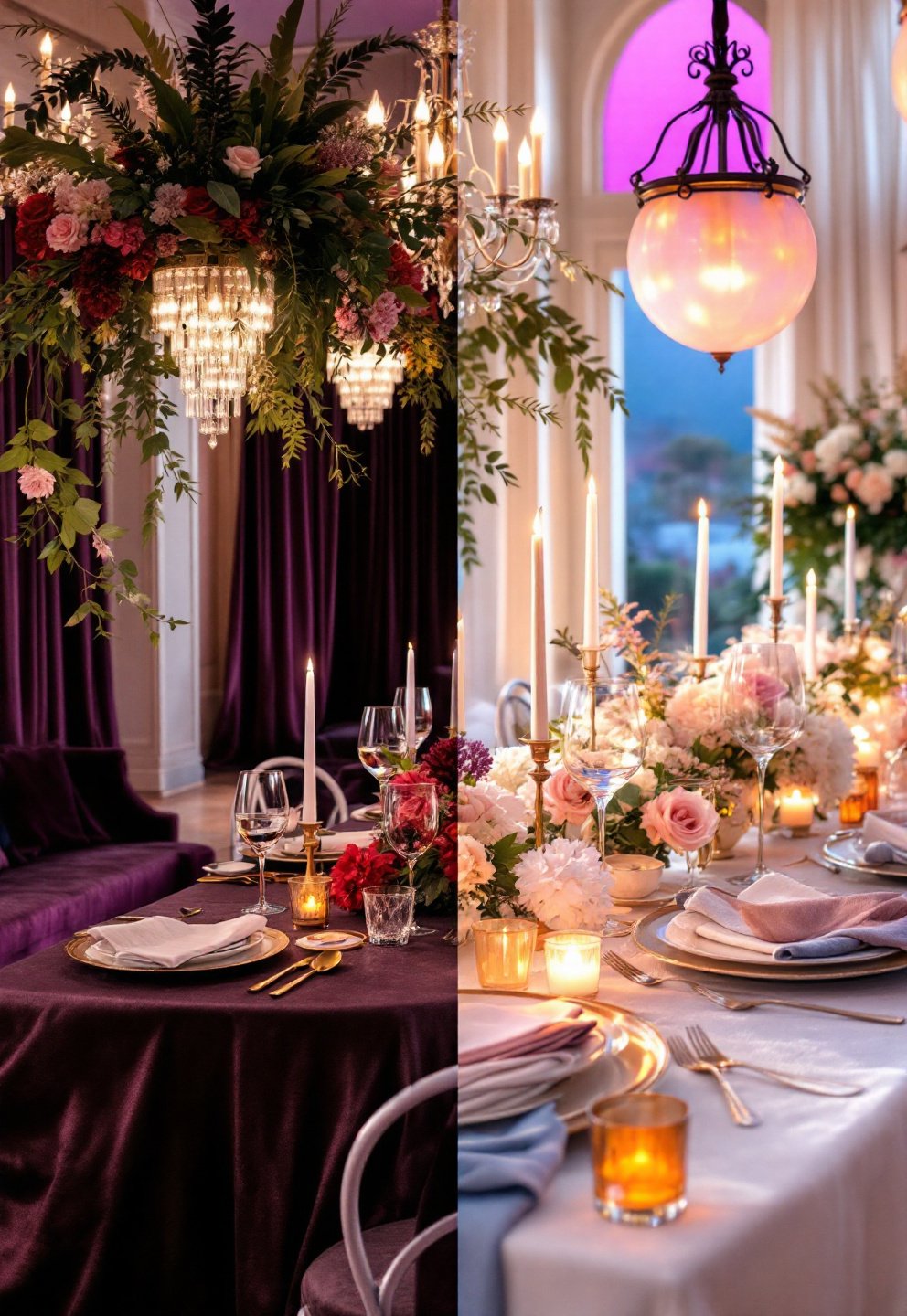
Executive snapshot — the two dominant 2026 color movements
The opalescent wedding color palette isn’t just a passing Pinterest crush: it’s been identified as one of two top-dog palettes for weddings in 2026, joined by “rooted romance” moody jewel tones like plum and merlot wedding colors and dusty olives. Pinterest reports an astronomical +2,710% bump in “opalite aesthetic” searches, with “plum and olive wedding” up 1,380%. The trend split? Grounded earth-inspired hues vs. shimmering, iridescent milky chromes. Whether you’re planning for mood or magic, knowing the core tradeoffs—and exactly what your venue, lighting, and budget will allow—is the key to making your vision look as good in photos as it does in your head.
Why these trends rose in 2026 — cultural & market drivers
“Sad beige” fatigue and a craving for personalization broke just as beauty and fashion embraced chromed and opalescent finishes—think Hailey Bieber chrome nails and mother-of-pearl eye shadow. Simultaneously, the climate-conscious crowd nudged a boom in the fig and olive palette and moody natural tones as the sustainable choice. Mass-market couples still lean white-and-green (sage is anchor color for 30%), but editorial and high-visibility weddings have raced toward either earthy drama or “ethereal shimmer.” The split isn’t just about colors: it’s an ambient statement—one feels romantic and mysterious, the other fantastical and dreamy. Pinterest’s trend tracking confirms both look set to dominate wedding imagery and rentals through at least 2026 (source).
Emotional tone, lighting sensitivity, and practicality
Each direction delivers something distinct—but the experience changes substantially depending on space, light, and execution:
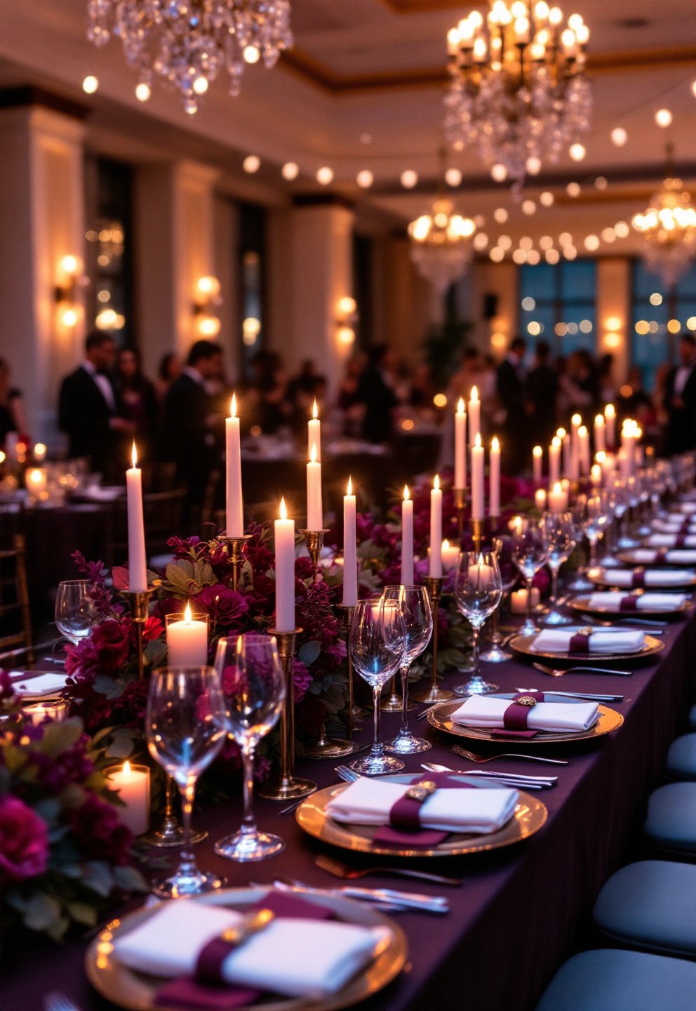
- Moody wedding color scheme (plum, merlot, olive): Deeply romantic and grounded, but absorbs light; best for formal, evening, or indoor events with layered lighting. Sourcing florals and linens is easy but can run heavy or flat without contrast.
- Opalescent wedding color palette: Delivers glamour, high fashion, and light-play, but is highly lighting-sensitive—looks flat or “plasticky” in poor light or flash-heavy rooms. As a finish, not a hue, it’s tougher to source consistently and can show up as a pale wash unless your lighting is on point.
Data: Opalescents rate “high” in lighting sensitivity and can collapse under harsh flash; jewel tones can look “poor” in bright outdoor daytime but “excellent” at night.
Venue & lighting match — rules of thumb
Matching your palette to your space (and not the other way around) is the single biggest factor in making it work. Here’s how it shakes out:
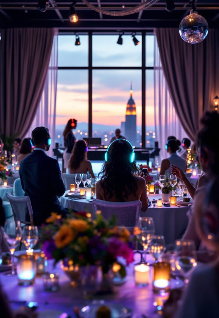
- Opalescent/iridescent: Best for indoor evening ballrooms, galleries, or spaces where you control ambient light. Chrome wedding accents shine (literally) in dim rooms under string lights, candles, or warm spot-ups. In bright outdoor venues? These finishes often read as grey or disappear entirely.
- Plum and merlot wedding colors: Thrive in evening outdoor receptions (especially fall) and most ballrooms. Risk looking muddy or overwhelming in bright outdoor settings, especially without lighter neutrals to buffer.
Quick guidance: Opalescents don’t photograph reliably in daylight or if you can’t dim/shape your lighting. If you’re in an old barn, greenhouse, or under a tent, strong earth or jewel tones are generally more forgiving (with a neutral anchor).
Photography & lighting playbook
This is the most make-or-break consideration for iridescent wedding decor. If you want your photos to look like Vogue, not a washed-out dance at a county fair, insist on the following:
For opalescent:
- Soft, continuous warm light (2400–3200K), ideally at lux levels 200–300 (think golden hour or heavy candles/edison bulbs). Avoid overhead white/pure LED.
- Photographers should use bounce flash or softboxes—not direct flash. Macro or close-ups with a low-aperture lens (f/2.8 or faster) bring out the color shift.
- Always run test shots at setup—the effect changes dramatically as lighting shifts.
For jewel tone reception:
- Layer in uplighting at floor/wall level to avoid dark voids. Use candlelight or gold metallic accents for specular interest.
- Shoot with slightly open shadows to avoid faces being swamped by dark backgrounds. Add ivory or champagne linens as photo buffers.
Summary: Opalescents “blow out” into a flat glare under direct flash; jewel tones can swallow detail if ambient light is low and there’s no contrasting surface in the frame.
Budget & sourcing — real numbers
- Chrome wedding accents: Iconic but pricey at scale. Large chrome spheres and sculptural decor run $1,345–$1,945 per piece. Small rentals (flatware, chargers) are now common and price on par with gold/silver for medium-sized events.
- Opalescent materials: Small decor or glassware accents cost $4.50–$15 each, easily rented or purchased in bulk. Bespoke linens, iridescent panels, or large acrylic decor require special order (with up to 25% margin for vendor mis-match—use swatches).
- Average overall decor spend for 2026 UK weddings is about £1,404, with focal pieces making up 20–45% of design costs.
Tip: Unless you have full control of lighting and a healthy line item for professional decor, use opalescent elements as accents—backdrops, napkin rings, or cake stands, not entire tablescapes.
Operational needs & vendor alignment
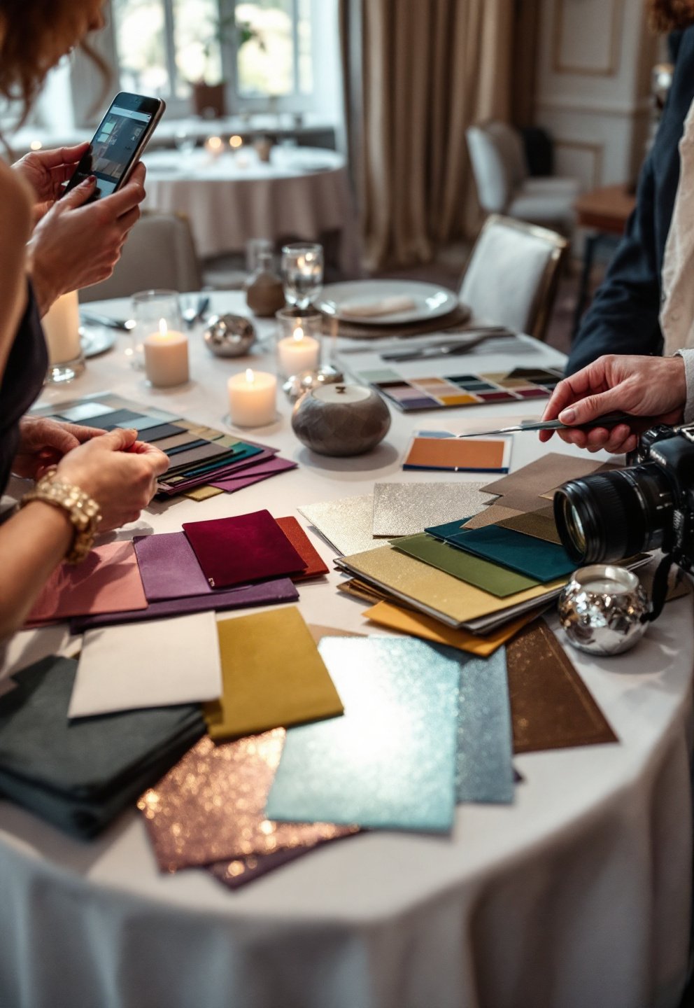
- The #1 pitfall with opalescent/chrome: finish inconsistency. Every vendor’s version of “iridescent” is a little different—mandate a one-page color spec with physical (not just digital) swatches.
- Chrome and super-shiny finishes show every fingerprint, dust, or scratch. Assign staff to clean/polish before photos. Add a maintenance clause or handling surcharge in contracts for rentals.
- Specify in contracts that supplier substitutions require your written approval to avoid discrepancies if a finish is discontinued or arrives mismatched.
- Coordinate lighting designers, planners, and photographers together to prevent “everyone’s doing their own thing”—test in the actual space, under the real event conditions.
If you’re working across florists, stations, rentals, and fabricators, schedule at least one physical color comparison (and be explicit for Pantone/hex/physical sparkles).
Seasonal and cultural guidance
No palette is universally seasonal or neutral—your best fit depends on both the time of year and the symbolism you want:
- Fall 2026: Deep plum, terracotta, sage, and merlot dominate; moody jewel tones anchor best in autumn and winter. Pair with metallics and warm ivory in December/January.
- Spring/summer: Opalescent/iridescent reads best in evening indoor settings, especially for “fairytale” or fashion-forward celebrations. For daytime garden weddings, stick with lighter earthy greens or sage, which blend with seasonality and floral availability.
- “Fig and olive palette”: Ideal for rustic venues and eco-first values. Opal/iridescent fits more “cinematic fantasy” vibes or cross-cultural ceremonies referencing pearl/mother-of-pearl symbolism.
Editorial note: Sustainability-concerned couples may want to swap synthetic iridescent films for dichroic glass, or use opal-accented jewelry/tableware over plastics.
How each palette photographs — visual checklist
What to test ahead:
- Place actual decor samples and swatches in your venue at the time-of-day you’ll celebrate; take real photos (phone and pro camera) under those lights.
- Jewel tones: High-contrast, dramatic in low light; risk losing facial detail if not balanced with ivory, blush, or metallics. Test in both color and B&W to catch unintentional dead zones.
- Opalescents: Easily go flat/grey in mid-afternoon daylight; shimmer shows best with side lighting or spot-lit table settings. Risk of skin tones going cool or facial features picking up blue shimmer unless warm light is layered.
- Keep to a maximum of 3–4 prominent colors to maintain visual harmony.
Remember: Swapping from inspiration board to real-life means accounting for light, reflection, and photography—test ahead, adjust as needed.
7 under-covered practical topics to include
Most articles gloss over these actionable realities—plan for them:
- Lighting Setup Specs: For opalescent decor, aim for 200–350 lux, color temperature 2600–3200K, and avoid direct top-down fixtures in main areas.
- Photography Workflow: Provide your photographer a shot list specifically for opalescent and chrome detail shots; recommend fast prime lenses and practice shots with both flash and continuous light before guests enter.
- Accessibility/Signage: Avoid white or pale text on opalescent or mirrored background—use dark, high-contrast type or add a solid neutral border.
- Chrome/Opal Maintenance: Assign one or two staff with microfiber cloths to polish key pieces before and during the event. Ask rental vendors about cleaning/handling policies.
- Sustainability Implications: Synthetic iridescent films create microplastic waste; seek glass or pearl-based alternatives. Chrome can be recycled, but not every decor vendor does this—ask if your provider reuses/repurposes large installations.
- Cultural Factors: In some cultures, opal/iridescent is associated with good fortune, the moon, or femininity; in others, chrome is strictly “futurist.” Match symbolism to event rituals when appropriate.
- Vendor Consistency Clauses: Instruct every decor/floral/fabricator supplier to match to a physical swatch, and require sign-off in contract on finish/spec changes—this can prevent mismatched “almost opalescent” items from slipping in last minute.
Decision framework & quick matrix
Unsure which way to go? Use this event-proven matrix:
| Factor | Go Moody | Go Opalescent (Accents) | Mix (Anchor + Accent) |
|---|---|---|---|
| Venue | Historic estate, ballroom, outdoor evening (controlled light) | Modern ballroom, gallery, speakeasy, fully dimmable | Blank canvas, adaptable mixed indoor/outdoor |
| Time of Day | Evening, fall/winter | Evening, night, spring indoor | Any, with intentional lighting zones |
| Photography Style | Cinematic, shadow-rich | Fashion, editorial, macro-focused | Fine art with mixed detail work |
| Budget | Moderate; maximize with floral/rental curation | High if using large chrome; moderate for opal accents | Variable; prioritize one focal opal/chrome |
| Sustainability | Yes; local flowers, reusable fabric | No unless using glass/pearl over plastic film | Yes if accents only and upcycled |
Best next step: Limit main palette to 3–4 colors. If you want opalescents, treat them as deliberate highlights unless you can design total lighting control. Always order physical samples to preview in the actual event environment and photograph them for reference.
Practical next steps for couples & planners
- Test physical swatches in venue light (at your actual event time). Photograph swatches under typical lighting to see true results.
- Brief photographer and lighting teams with your palette goals and the points above; insist on test shots if using opalescent or chrome decor.
- Budget for at least one strong focal accent if going chrome—otherwise, expect to use smaller elements only.
- Add contractual specs (finish, material, color) to all decor/fabricator and rental agreements; require sample sign-off and substitutes review.
- Plan for cleaning staff (or family/friends in DIY) for chrome/opalescent pieces, especially for cocktail hour and portrait time.
- Get competitive flower wall rental quotes for backdrop options, especially if blending palettes.
- Refer to the outdoor wedding venue guide or luxury venue selection for space-specific decor advice.
Above all, test everything visually and photographically before committing—palettes behave differently than moodboards suggest. Prioritize a single anchor color and use opalescent/iridescent elements as accents unless your lighting and budget permit grander statements.
Which venues suit an opalescent wedding color palette best?
Indoor evening ballrooms, modern galleries, or any venue where you can strictly control ambient light are ideal. Outdoor venues or bright daytime spaces rarely do the opal finish justice.
How can we make sure opalescent and chrome items match across vendors?
Distribute a one-page color spec with Pantone/hex codes and, crucially, physical swatches. Specify in contracts that all finishes must match the approved sample, and require subs approval for last-minute changes.
Are opalescent palettes budget-friendly?
Small iridescent decor elements can be economical, but large chrome installations or specialty linens are expensive ($1,300+ per piece for focal chrome features). Use opalescent as a highlight unless your budget is substantial and allows for lighting design.
How do we photograph opalescent decor so it sparkles?
Use soft, continuous warm light. Photographers should avoid direct flash, using bounce or diffused setups. Run test shots before guests arrive and focus on close-ups with intentional directional light to capture the shifting color.