Butter Yellow Event Styling: Palettes, Flowers, Lighting and How to Brief Suppliers
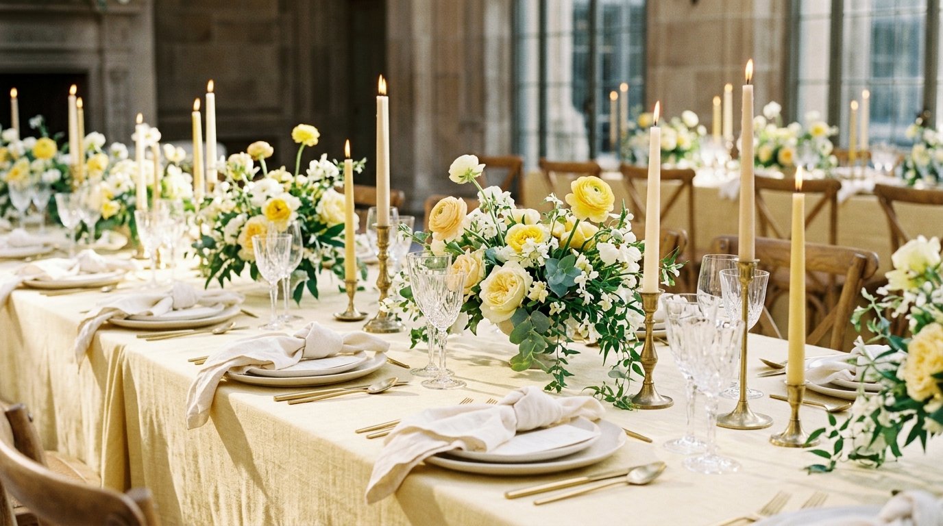
Butter yellow is the soft, creamy yellow of fresh butter: paler and warmer than lemon, lighter than mustard, and far easier to live with than a bright primary yellow. It has become one of the most requested event colours because it photographs as warm and cheerful without shouting, and it sits comfortably next to greenery, natural wood and white linen. It is also easy to get wrong. Too much of it looks washed out on camera, the wrong lighting turns it orange, and mixing several yellows at random makes a room look muddled rather than styled. This guide explains how to plan a butter yellow event properly: which shades to use, what to pair them with, how to split the colour between linens, flowers, stationery and lighting, and how to brief your suppliers so everyone delivers the same yellow.
Watch more on TikTok and Instagram.
The short answer
- Choose one butter yellow as your anchor and show suppliers a physical swatch, not just a photo on a phone.
- Use it as the accent, not the base: roughly 60% neutral (ivory, white, natural wood), 30% a supporting colour (sage, soft green or blue) and 10% butter yellow in its strongest form.
- Put the yellow where guests look and cameras focus: napkins, flowers, stationery, cake and the backdrop behind the top table.
- Plan lighting carefully: very warm bulbs push pale yellow towards orange; neutral-warm light keeps it creamy.
- Add one darker contrast (deep green, navy or terracotta) so the scheme does not look faded in photographs.
What counts as butter yellow
Suppliers use the name loosely, so define it before you book anything. Butter yellow sits in a narrow band: a pale, slightly warm yellow with a creamy, almost buttermilk quality. It is warmer than lemon or primrose, which lean cool and green, and lighter than mustard, ochre or saffron, which lean brown or orange. A useful test is to place the swatch next to pure white: butter yellow should look clearly yellow but soft, not neon and not beige.
Pick one reference shade and create a small swatch card: a fabric offcut, a paint chip or a printed sample. Give a copy to your florist, linen supplier and stationer. Screens shift colour too much to be reliable, and three suppliers working from three different phone photos will almost always deliver three different yellows.
Palettes that work with butter yellow
Butter yellow, sage and ivory
The easiest and most forgiving combination. Sage tablecloths or runners, ivory napkins with a butter yellow ribbon, white and pale yellow flowers with plenty of soft foliage. It suits garden venues, daytime weddings, christenings and spring birthdays, and it pairs naturally with the loose, gathered look in our meadow-style tablescape guide.
Butter yellow and blue
Pale yellow with powder blue feels fresh and nostalgic; with cobalt or navy it becomes graphic and more formal. Use blue for glassware, stationery or patterned plates, and keep the yellow for flowers and napkins. Blue-and-white ceramics with yellow flowers is a classic look for summer lunches and Mediterranean-style venues.
Butter yellow, terracotta and natural textures
For autumn or rustic venues, combine butter yellow with terracotta, rust and natural linen, plus rattan, wood and dried grasses. Keep the terracotta in smaller doses, such as candle holders, pots and runners, so the overall feel stays light.
Butter yellow and lilac
A soft pastel pairing for baby showers, bridal showers and spring parties. Keep everything else white so the two colours read clearly, and use greenery generously to stop it looking like a sweet shop.
Gingham and print
Yellow-and-white gingham or a small floral print brings a picnic or vintage feel. Use it on one element only, such as napkins, a bar front or a cake table, and keep the rest plain.
Where to put the colour
Butter yellow works best when it repeats in a few deliberate places rather than covering everything. A practical split for a seated dinner:
- Linens: neutral tablecloths, butter yellow napkins or runners. Yellow full-length tablecloths across a whole room are usually too much and can look cheap under flash.
- Flowers: the strongest dose of yellow, mixed with white and green.
- Stationery: invitations, menus and place cards in ivory with a yellow detail such as a border, wax seal or ribbon.
- Focal point: one bold moment, such as the backdrop behind the top table, a flower arch or the dessert table, where yellow can be more saturated.
- Small touches: candles, ribbon on chairs, cocktail garnishes (lemon, chamomile, edible flowers) and favour packaging.
Flowers in butter yellow
Florists can find pale yellow flowers in most seasons, but availability and price change through the year, so ask your florist what is good in your month rather than fixing a list too early. Ranunculus, garden roses, spray roses, tulips, carnations, freesia, chrysanthemums and mimosa can all come in soft yellows; daffodils and narcissi suit early spring. Mix two or three yellows that are close in tone, add white flowers to soften, and use plenty of foliage. If you want to understand how flower quantities and costs build up, our guide to planning event flowers walks through it.
One caution: bright golden flowers such as sunflowers or craspedia can overpower a butter yellow scheme. Use them only if you want a stronger, sunnier look.
Lighting and photography
Pale yellow is sensitive to light. Very warm bulbs, candles in large numbers and late golden-hour sun all push it towards orange or peach. Neutral-warm light keeps it creamy. In practice:
- Ask the venue or lighting supplier for bulbs that are not overly amber if yellow is your main colour.
- Add candlelight at tables, but avoid washing the whole room in amber uplighting.
- Include one darker colour (deep green, navy, terracotta or black detailing) so photographs have contrast.
- Ask your photographer to test a few shots of your swatch card under the venue’s lighting during the walkthrough.
Butter yellow by season and event
- Spring: with sage, white and lilac; tulips and narcissi.
- Summer: with blue and white ceramics, linen and citrus.
- Autumn: with terracotta, rust and dried grasses.
- Winter: with deep green, candlelight and gold, used sparingly.
- Baby showers: a gender-neutral favourite with white and green.
- Corporate events: as a cheerful accent against a neutral brand palette.
Common mistakes
- Too many yellows. Lemon napkins, mustard flowers and gold chargers on one table look accidental. Keep the yellows within one family.
- No contrast. All pastels plus white light can look flat in photographs.
- Yellow on yellow walls. Check the venue’s paint and floor colour. Cream or yellow-beige walls can make pale yellow disappear.
- Briefing by name only. “Butter yellow” means different things to different suppliers. Send the swatch.
How to brief your suppliers
Write one short styling note and send it to everyone: the anchor colour with a swatch, the supporting colours, the neutral base, where each colour should appear, and two or three reference images that match. Include the venue’s lighting and wall colours. Ask the florist and linen supplier to send a photo of their samples next to your swatch in daylight before confirming. For a full planning structure covering budgets, timelines and supplier checklists, see From Zero To Fabulous, our step-by-step event planning guide.
Frequently asked questions
Is butter yellow only for spring and summer?
No. It is most common in warm months, but with terracotta, rust or deep green it works well in autumn and winter.
What colour should the bridesmaids or hosts wear?
Butter yellow dresses look lovely, but check them under the venue’s lighting and against the bride’s dress, as pale yellow can make ivory look grey. Sage or soft blue are safe alternatives.
Does butter yellow suit evening events?
Yes, if you add a deeper contrast colour and keep the lighting neutral-warm rather than amber.
How much yellow is enough?
Start with about one tenth of what guests see in strong yellow, plus softer touches. You can add more at the styling stage; it is harder to take colour away once it has been ordered.